
Dashboard Update 3.0
Texans...
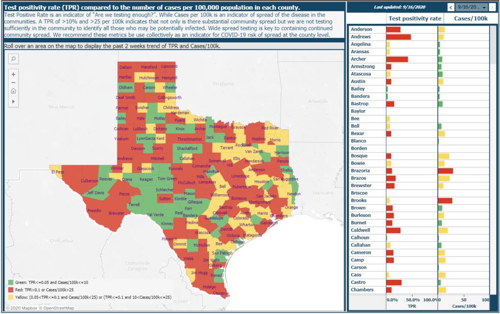
For those of you that haven't noticed, we updated the www.texaspandemic.org dashboard!
On top of hotspots, trends, hospitalization rates, testing rates, fatalities, and case demographics, we now have added....
Hot spots based on test positive rate (TPR) AND new cases per day. The combination of these two metrics are being used to drive school-, county-, and state- level policy (we hope). Essentially, you want a county to be in the green for BOTH. If a county is in the red for either, we are in trouble in regards to COVID19 spread.
We also included mobility data per county. Using mobile phone data, we can see how movement to work, parks, grocery stores, and to non-essential stores have changed over time. And, as always, we include interpretations in there for you too.
Enjoy!
Love, YLE