
July
Well, July wasn’t pretty…either.

In order to get the best comprehensive picture, I triangulated several constructs:
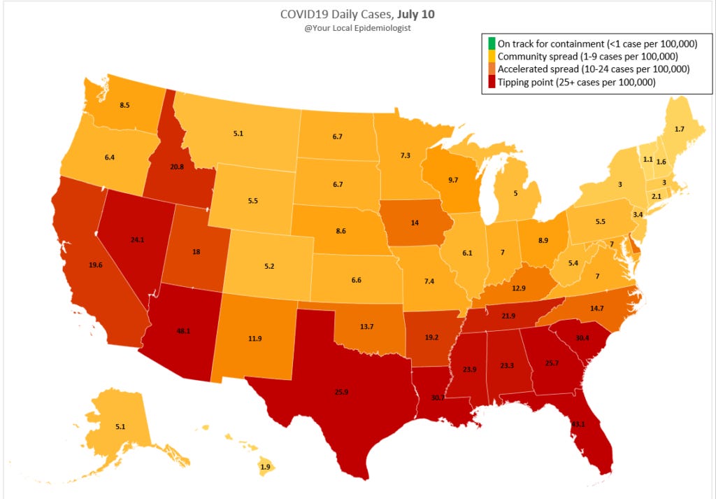
Cases (i.e. incidence): In the month of July, 23 states jumped to a higher CDC COVID19 risk category. For example, OK jumped from orange (13.7 daily cases per 100,000) to red (26.8 daily cases per 100,000). Shout out to VT…the only state that got better (jumped from yellow to green). VT is the first state to make it to the green risk category.

Deaths: Because of increased incidence, cumulative and daily deaths have increased in July for the majority of states. The figure includes daily deaths July 31 compared to July 1. NJ is looking good! CFR or IFR are incredibly difficult to estimate (and take a lot of time), so I didn’t include. See earlier posts: https://yourlocalepidemiologist.com/case-fatality-rates/; https://yourlocalepidemiologist.com/case-fatality-rates-2/).

Testing (i.e. test positivity rate [TPR]): 41 states look like they have testing under control (under 10% TPR). Although we really need to get this to below 5%. There are 10 states that need some serious help (over 10% TPR). We are looking at you AL, AZ, FL, GA, ID, LA, NE, SC, TX, and VA.

Hospitalizations: Not even going to try to compare July 31 to July 1 because of the data reporting switch. But hospitalizations did increase in July. We know this because incidence and deaths increase.
The good news is that it LOOKS like some states may have recently (like past two days) reached their peak. If you live in one of these states, DO NOT CHANGE A DARN THING. We need to be well down the curve to start opening strategically and changing individual behaviors.
Maybe August will be our month?? Here's the BEST peer-reviewed scientific article of how to get out of this mess by October.
Love, your local epidemiologist
Data sources: Analysis and graphs (except the first one) by yours truly. Data came from many sources: COVID19 tracking project, Harvard , and CDC.