Si quiere leer la versión en español, pulse aquí.
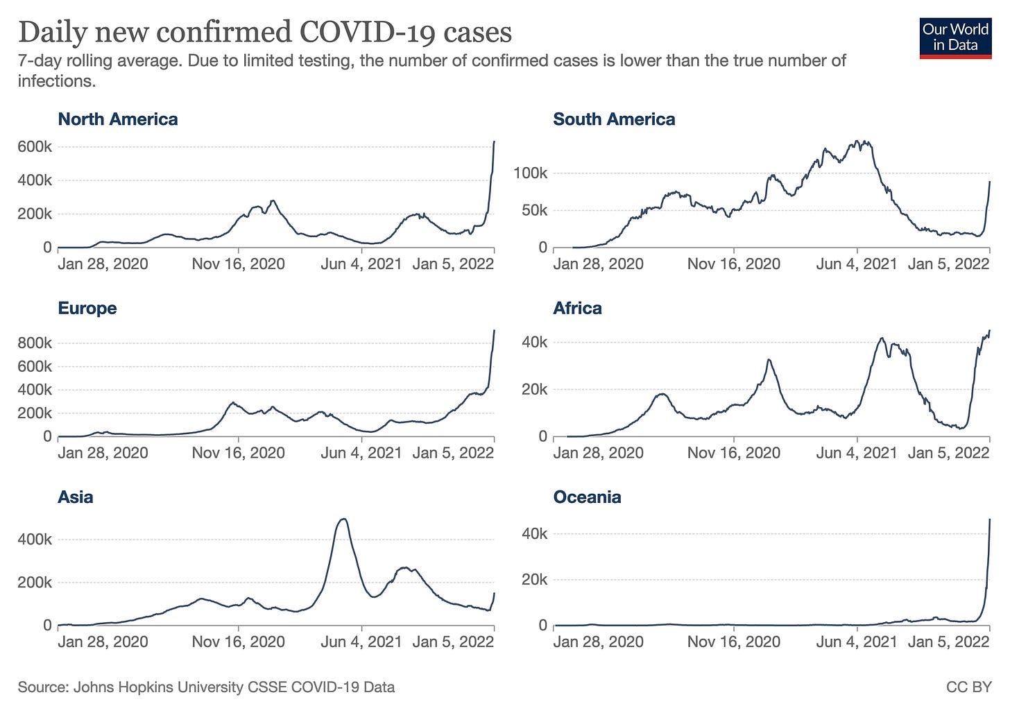
The world reported more than 9.5 million cases last week, which is a 71% increase compared to the previous week. Although the greatest increase is still in the Americas (+100%), every region in the world now has increasing case trends. (Notice the y-axis is different for each region in the figure below).
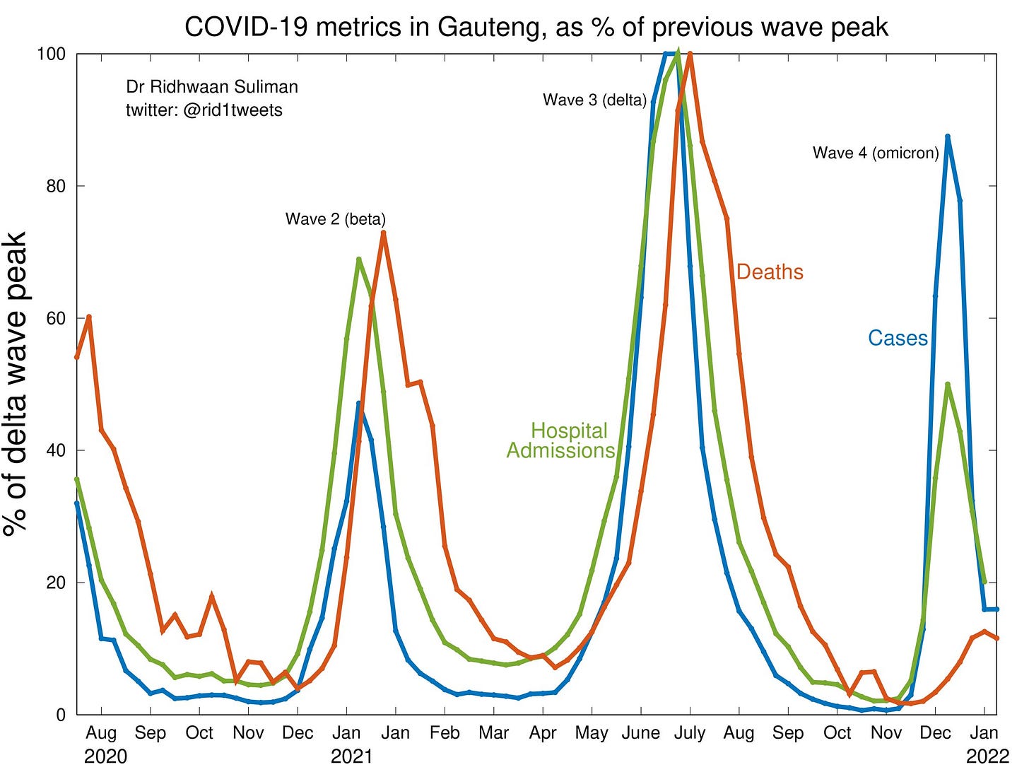
South Africa continues to see a decline in cases. While their death trend is still increasing, this should be peaking soon, too. There, deaths are currently 25% of the Delta wave. Only 27% of South Africa is fully vaccinated, so this decoupling is thought to be attributed by infection-induced immunity (and lower Omicron severity). The epicenter—Gauteng— has reached a point in which all COVID19 indicators have peaked: Cases peaked at 90% of the Delta wave, hospitalizations peaked at 50%, and deaths peaked at 15%.
United States
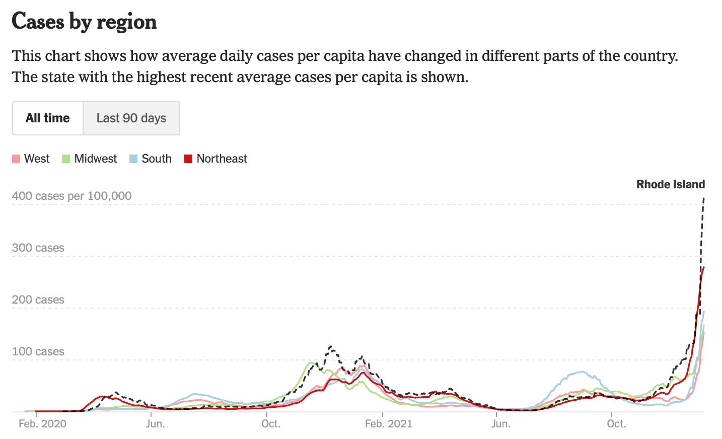
Cases continue to skyrocket in the United States with a 226% increase in the past 14 days. The Northeast continues to be the case leader: Rhode Island has a whooping 413 daily cases per 100,000, followed by New York (369 per 100K), New Jersey (351 per 100K), and Massachusetts (289 per 100K).
But the South, Midwest, and West are closely following behind now. The South is accelerating the fastest with Mississippi as the case growth leader (+702%), followed by South Carolina (+652%), Texas (+614%), and Louisiana (+546%),
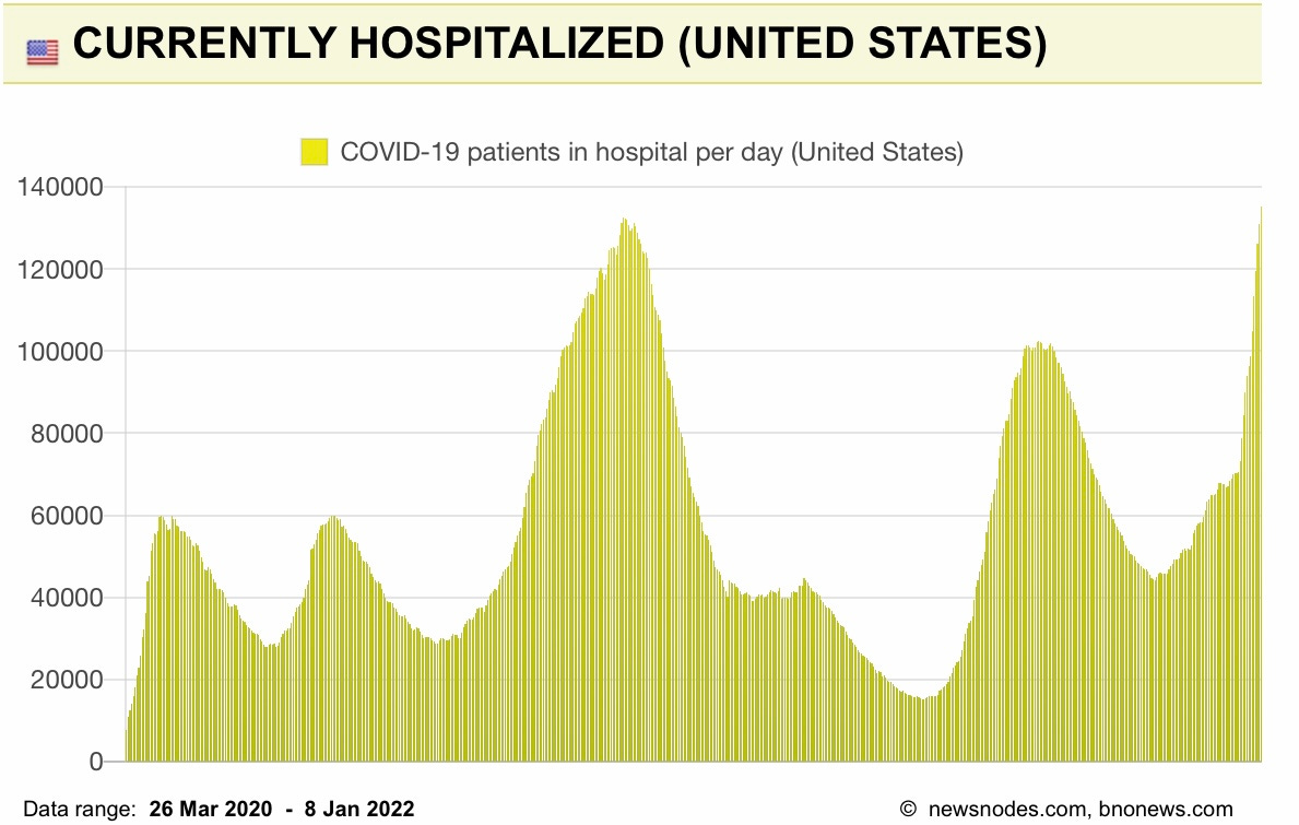
On a national level, hospitalizations continue to rise and, in the past two weeks, increased 78%. Yesterday we broke the pandemic record with 135,292 hospitalizations (surpassing the previous peak of 132,474 hospitalizations on Jan 6, 2021).
Deaths are increasing modestly at +12% over the past two weeks, but this is always the last indicator to increase. So I’m afraid we will have more deaths from this vaccine-preventable disease. On average, 1,524 people are dying each day.
How do indicators compare to previous waves?
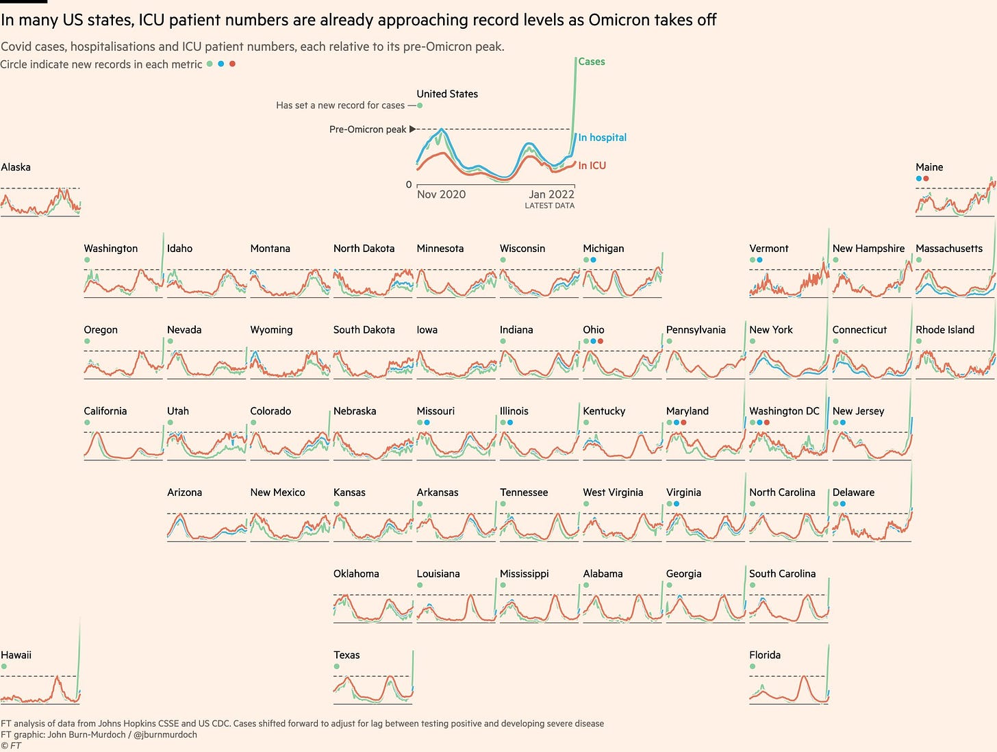
Below is a brilliant graphic of cases, hospitalizations, and ICU patient numbers relative to each state’s pre-Omicron peak. Briefly, the green line represents cases, blue is hospitalizations, and red is ICU patients. The dashed line indicates the pre-Omicron peak for each state, and the dots (green, blue, and red) indicate new records in each metric. Currently, 35 states are breaking case records, 10 states are breaking hospitalization records, and 3 states are breaking ICU records (Maryland, DC, and Ohio).
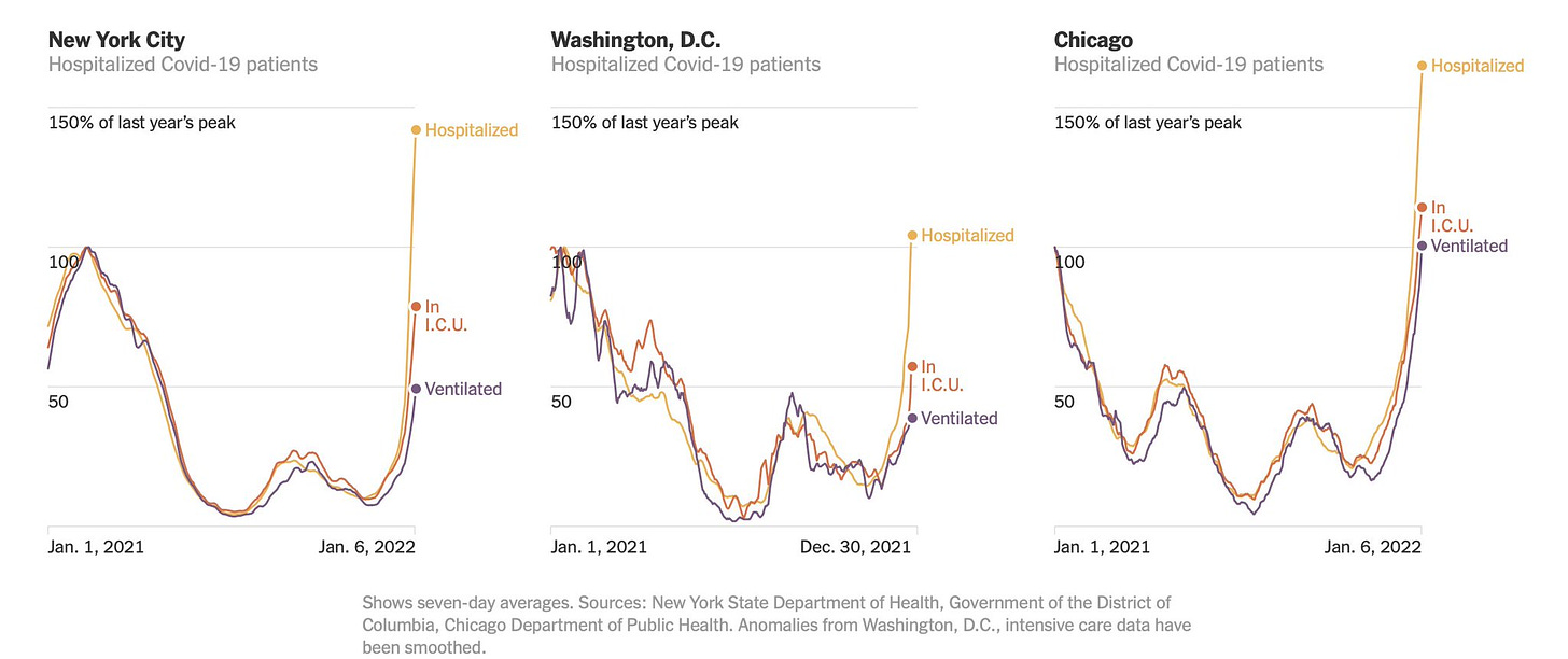
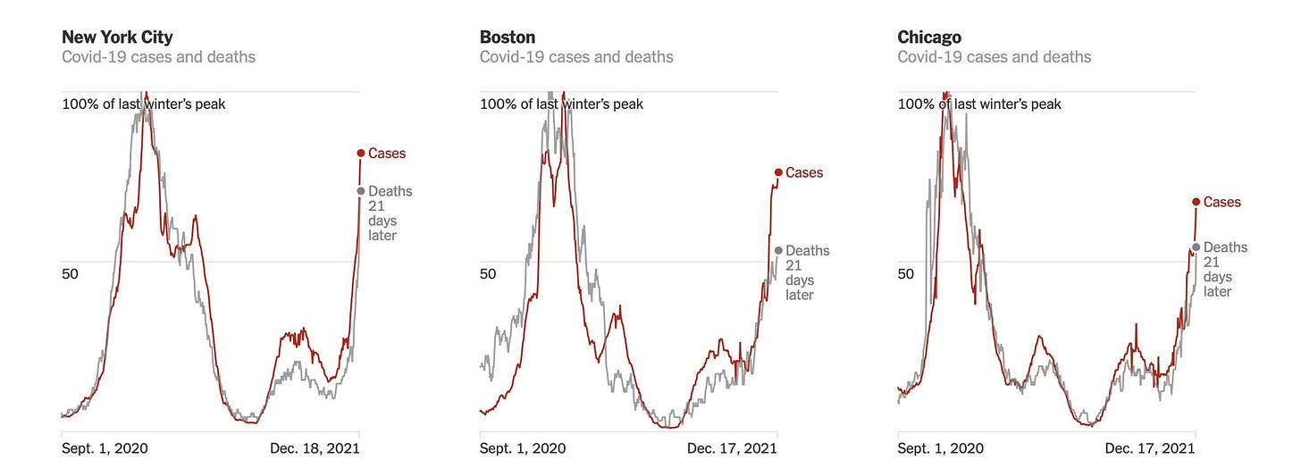
There is clear decoupling of hospitalizations from cases in most states, but certainly not all. We haven’t seen the decoupling yet in hard hit cities, like NYC, Boston, and Chicago. In other words, there’s no separation between increases in cases and increases in hospitalizations and deaths (see figures below). But it’s important to note that deaths lag cases and these graphs anchor cases on Dec 17 (so these deaths may still be from Delta, not Omicron). It will be important to watch this in the coming weeks.
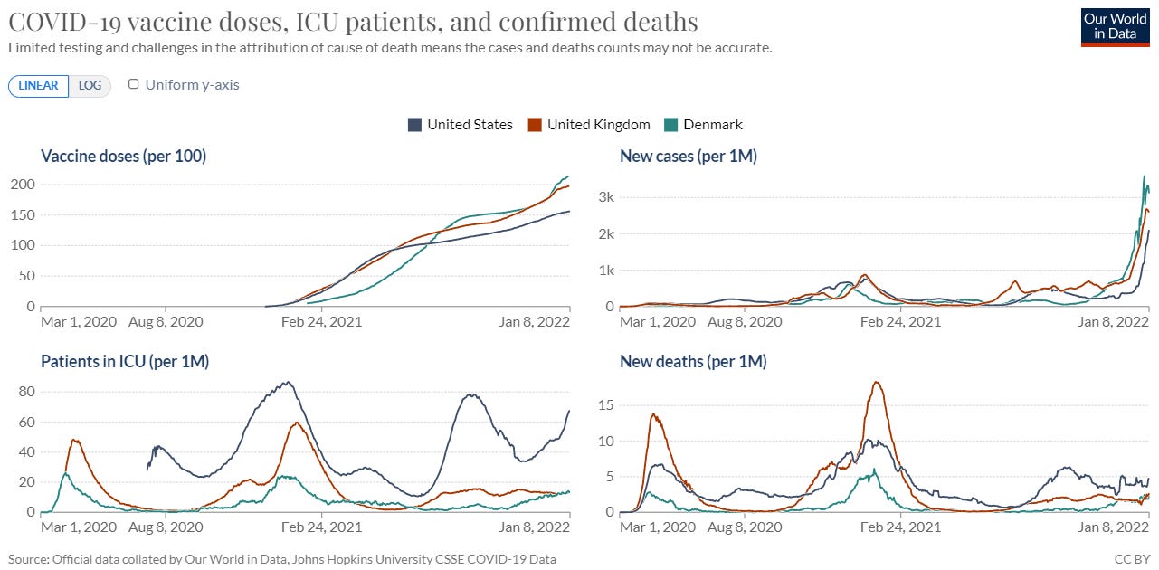
Nonetheless, what’s becoming more clear is the decoupling phenomenon is less pronounced in the U.S. compared to other countries like Denmark and the U.K. There are clearly more cases in Denmark and the U.K. compared to the U.S. (see figure below). However, the U.S. has many, many more patients in the ICU per capita. There are many reasons for this (like demographics, human behaviors, etc.), but the most glaring is that the U.S. started off at an already high rate (thanks to Delta) and has a lower vaccination (and specifically booster) rate.
The capacity of the United States’ hospital system is of the utmost importance. And a lot of states are starting to creep into trouble. A hospital capacity database, created by Bill Hanage, Benjy Renton, and Jeremy Faust, predicts when circuit breakers are needed. Circuit breakers are short-term mitigation measures needed to preserve hospital functioning, like stopping elective surgeries and/or strict community measures to flatten the curve (like eliminating indoor dining, stopping concerts, and encouraging working from home). There are zero states at this point, but 18 states are forecast to exceed capacity within the next 1-10 days. This may have already happened in D.C., as the D.C. Hospital Association requested Health State of Emergency to reimplement Crisis Standards of Care yesterday. An additional 14 states are at an “unsustainable” hospital capacity and 20 states “have capacity.” While states as a whole haven’t reached circuit-breaker status yet, 585 counties peppered throughout the United States are considered to be at breaking point and policy makers really need to do something at this point.
Where are we going?
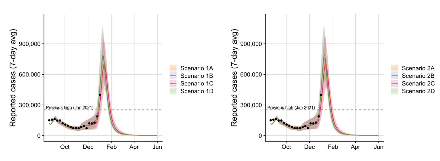
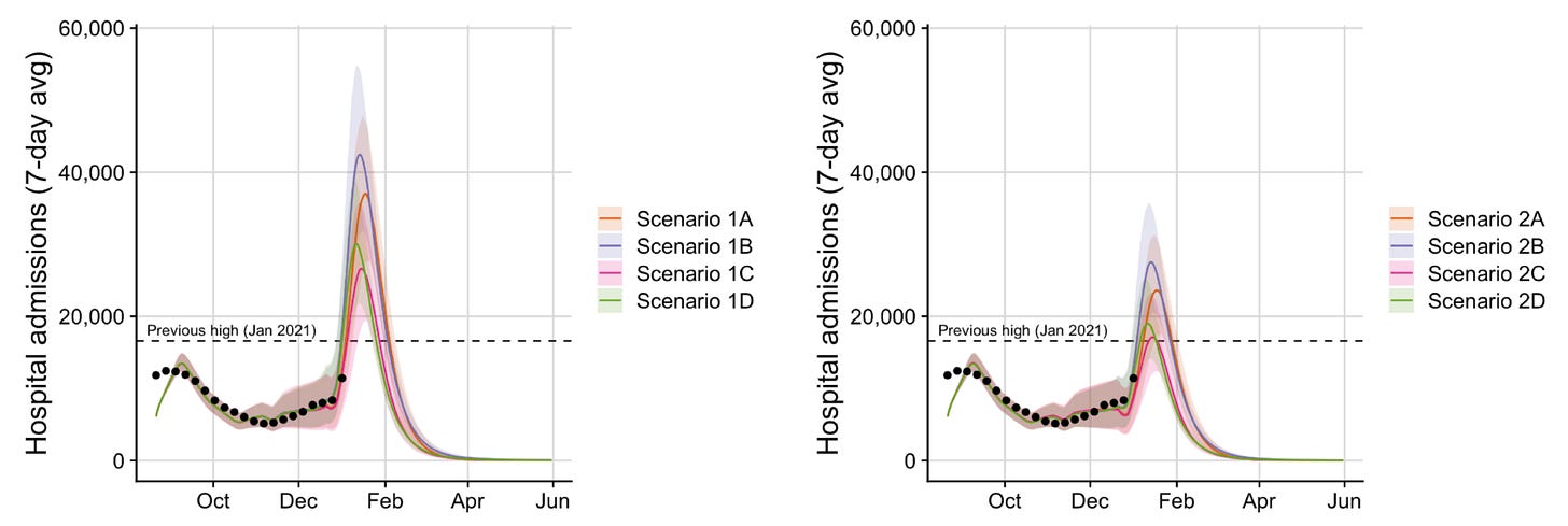
Projections are incredibly difficult for many reasons: the situation in other countries isn’t necessarily the situation we’ll see here, we’re learning about Omicron as we go, and projections don’t take into account human behavior. So, unfortunately, the original projections from University of Texas were off: They estimated that we would peak between 230,700 (best case scenario) and 552,400 cases per day (worse case scenario). We’ve already passed this (yesterday our 7-day average is 656,478 cases). So, on January 6, the University of Texas updated their projections taking into account the new science.
The graphs below display their new projections for cases, hospitalizations, and deaths. The graphs on the left and right correspond to the high and low severity scenarios, respectively. Briefly:
Best case scenario: By January 13, an average of 766,800 people catch the virus every day—about 20% higher case rate than yesterday. In this scenario, Omicron would lead to a peak of 17,700 daily hospital admissions and 1,700 deaths per day.
Worst case scenario: By mid-January, more than 850,200 people will catch the virus every day, which is more than 200% the peak reached last winter. 43,200 people would be hospitalized per day and 3,900 would die every day.
All case projections have the U.S. peaking mid-January. There are also several hard indicators showing that we will peak soon:
Countries like the U.K. and Denmark, who are ahead of the U.S. in the Omicron wave by ~2 weeks, are peaking. Hopefully this means we are next.
Cases have seemed to peak in early Omicron states like D.C., Delaware, and Puerto Rico. This could be a reflection of bad weather (snow storms in the Northeast impact on case reporting) and/or overwhelmed labs (contributing to case report lag). We should know in the next few days whether these peaks are “true” signals.
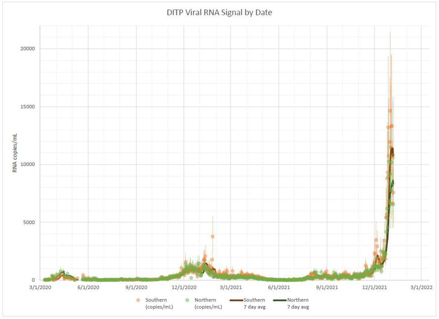
Viral load in Boston’s wastewater has begun to decline. Throughout the pandemic, wastewater has acted as a reliable predictor (4-10 days prior) of case patterns. This is a good sign that areas in the Northeast will be peaking soon.
Time will tell when we peak. But, regardless, this will be a peak in cases. Once we reach that point, we still have a 3-4 week window for hospitalizations and deaths to peak. It will be a rough couple of weeks coming up. Hang in there.
Love, YLE
“Your Local Epidemiologist (YLE)” is written by Dr. Katelyn Jetelina, MPH PhD— an epidemiologist, biostatistician, professor, researcher, wife, and mom of two little girls. During the day she has a research lab and teaches graduate-level courses, but at night she writes this newsletter. Her main goal is to “translate” the ever-evolving public health science so that people will be well equipped to make evidence-based decisions. This newsletter is free thanks to the generous support of fellow YLE community members. To support the effort, please subscribe here:





Thank you for continuing to give us the data! As frightening as it is reality helps us all make sound personal decisions.
Maryland hospitals passed their breaking point between Xmas and New Year’s and started shifting into crisis standards of care. No decoupling here other than the vaccinated have a dramatically lower hospitalization rate. Everyone else is being hit hard like before.