


State of Affairs: March 21

It’s clear that BA.2 is finishing what BA.1 started. Because of this, the shape of the overall Omicron wave (which includes all the sublineages— BA.1, BA.1.1, BA.2, BA.3) is varying across the globe. We saw a similar phenomenon last spring with Alpha. In general, there are four Omicron wave shapes:
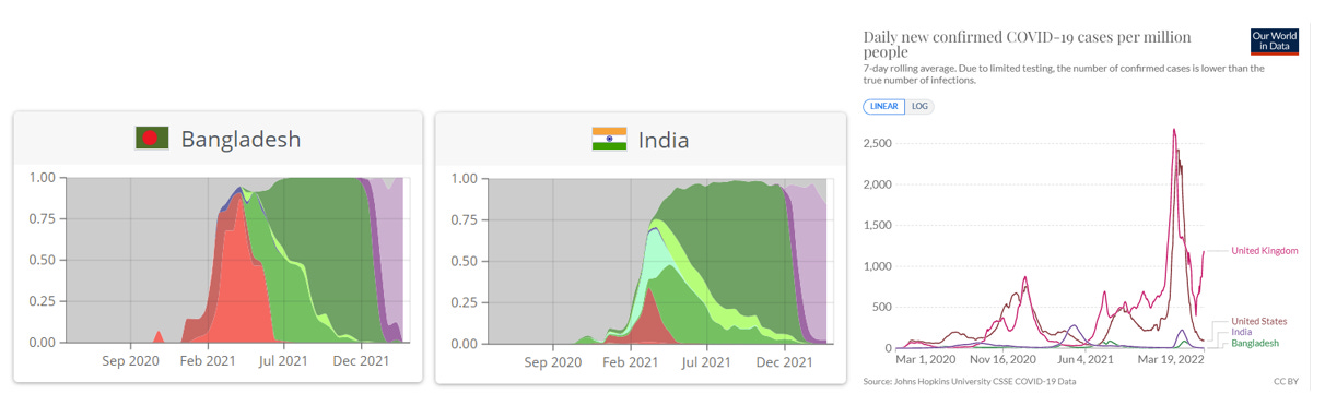
No large BA.1 or BA.2 wave: There are countries, like India and Bangladesh, in which we know BA.1 and BA.2 arrived, but cases have been eerily minimal compared to other countries. At least for now.
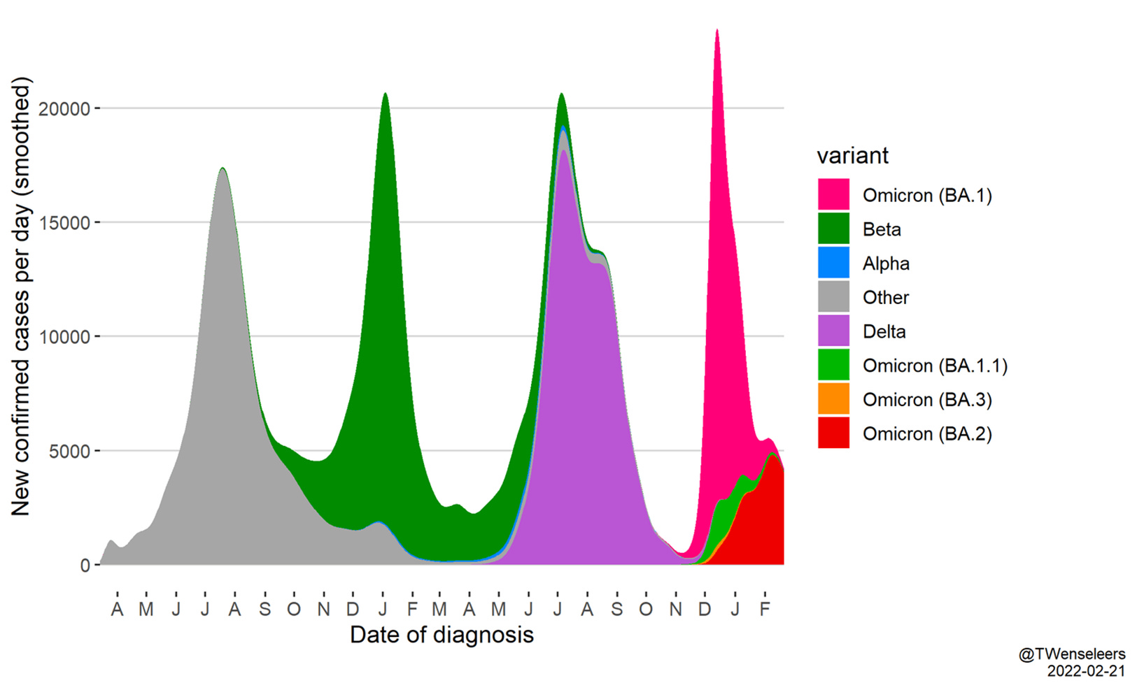
Large BA.1 and no BA.2: The best example of this is South Africa. In the figure below, BA.2 (red) didn’t make a sizeable impact on overall cases after BA.1 swept through.
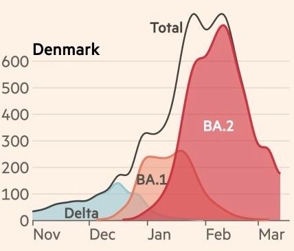
Small BA.1 and large BA.2: This is best portrayed by Denmark (see figure below by Financial Times). While BA.1 started Denmark’s wave, it was quickly driven by BA.2, making it one of the largest waves we’ve seen in the pandemic. As discussed earlier, Denmark also removed all mitigation measures at the same time.

7-day average of new confirmed cases per 100K, by variant. Source: Financial Times. Double hump wave: And then there are countries, mostly in Europe, which are seeing two humps in their Omicron case pattern. One from BA.1 and the other from BA.2. Overall, cases are still rising across Europe, but have slowed down. Germany, Greece, and Switzerland are losing momentum. The Netherlands peaked.

U.S. update
BA.2 now makes up 23% of cases in the U.S. and we expect this to increase to 100% over time. We don’t know what BA.2 will look like in the U.S. We could see a second hump, like Europe, or no overall increase, like South Africa. Or, perhaps we may see an increase in only some states. (This is exactly what happened with Alpha and has my vote.)
BA.2 makes up the highest proportion of cases in the Northeast (see pie charts below; pink=BA.2; purple=BA.1). So, if we do see an uptick in cases, it would be in the Northeast first.

Wastewater
Wastewater is our best early indicator of change. However, the CDC only displays wastewater surveillance for some jurisdictions. On top of this, they only report trends (% increase or decrease) as opposed to absolute numbers. This is a challenge because, for example, a 1000% increase of a small number can still be a small number. Right now, wastewater data is very noisy—some places are increasing and some are decreasing.
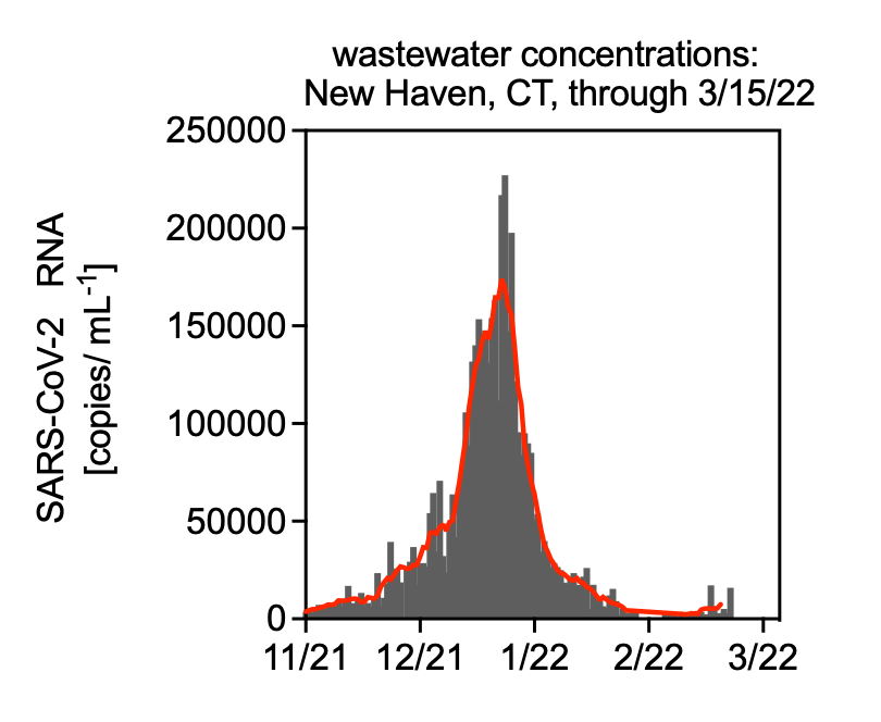
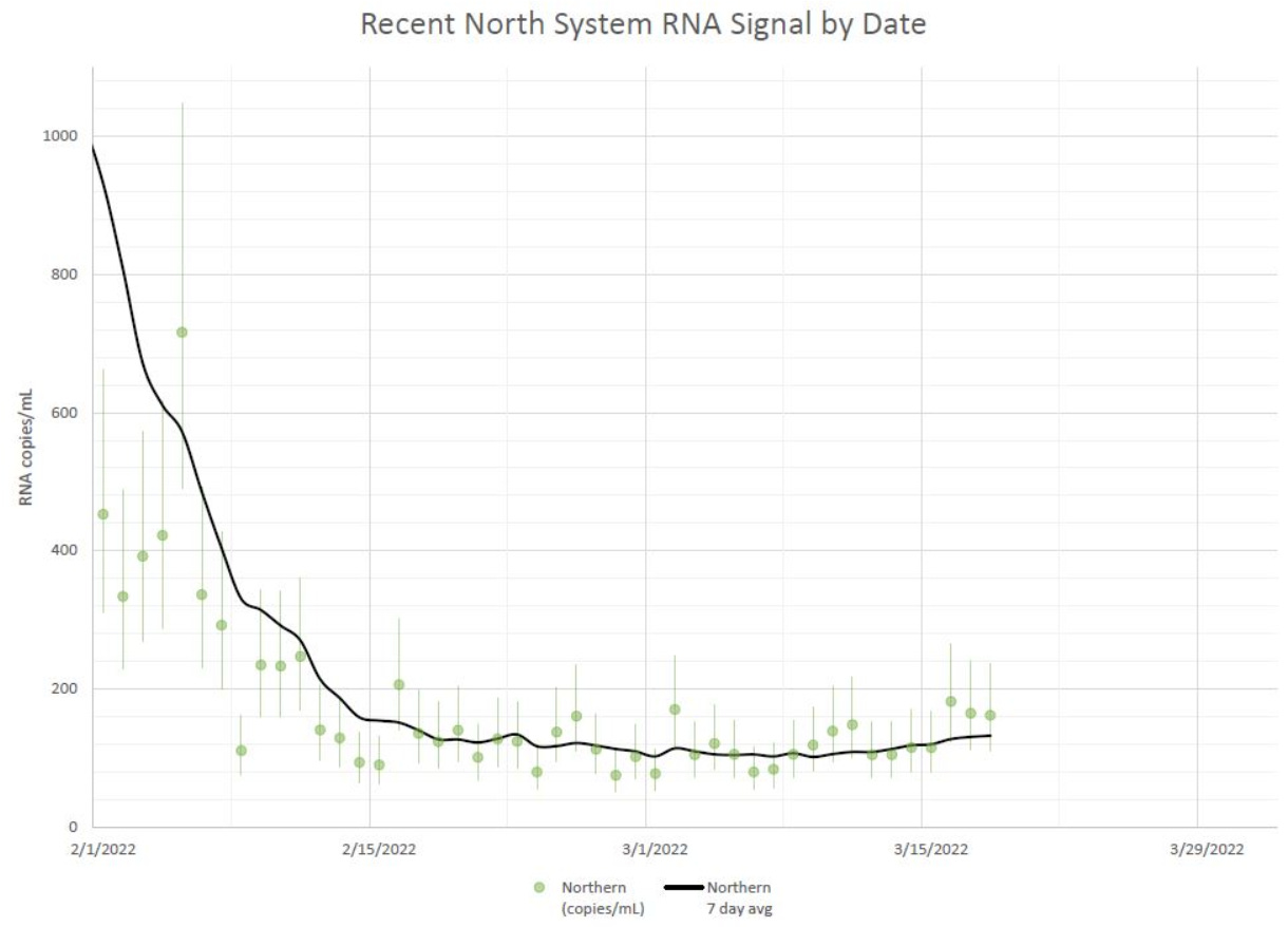
In the Northeast, Yale (New Haven, Connecticut) has a great system to follow. On March 10, New Haven crossed the threshold of >50% BA.2 cases. Subsequently, their wastewater started to increase. The graph below is updated every Wednesday, so I’ll be very curious to see how this trend continues this week.
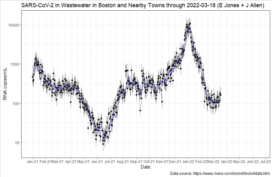
In Boston, viral loads in fecal samples may have started to slightly uptick? A little? The second graph is a log graph showing the the rate of change.
Test positivity rate (TPR)
TPR is another early indicator that we’ve used throughout the pandemic. It’s up for debate how accurate this still is given at home antigen testing, but this too has plateaued. If you squint, there’s a TPR uptick in the last day or two.
I recently discovered an antigen testing website run by Carnegie Mellon University. They map positive antigen tests from laboratories overtime. As you can see in the figure below, positive antigen tests are increasing in the Northeast. In Massachusetts, for example, 4 out of 100 antigen tests are positive, which is a 27% increase in the past 7 days.
Cases
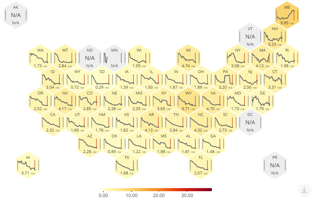
On a national level, case trends have been declining but are starting to lose momentum and plateau. New York is the only state that has an increasing case trend, with a 15% increase in the past 14 days. It’s an increase from a very small number to another small number, but we should keep an eye on it.
There are a few random case hotspots, including Alaska, Kentucky, the Texas panhandle, and some parts of Idaho, but these places have declining trends.
Even though cases in the rest of the U.S. are declining/plateauing, there are still pockets of high transmission. Our Omicron peak was so incredibly high that it will take time to come down. And some places are just not there yet.
Epidemiologist Dr. Jason Salemi figured out how to access the old CDC transmission map (right map below) and compared it to the new CDC community level guidance map (left map below), using current data for both. On the left, 99% of counties are “green,” which means they have less than 200 cases per 100K. According to the new CDC guidelines, you can take off your mask in these areas because hospitals won’t reach capacity any time soon. This is very different from taking off masks for your own protection against infection, which is an important distinction I fear is lost among the public. The right map shows many counties in the “orange” or “red,” which means “substantial” to “high” transmission, as cases are >50 per 100K. I wouldn’t take off masks here just yet.

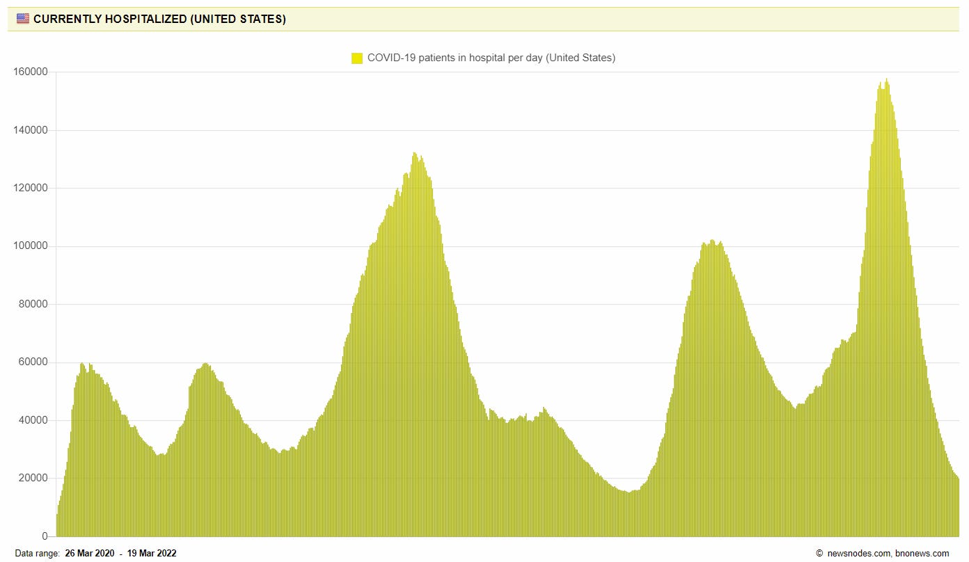
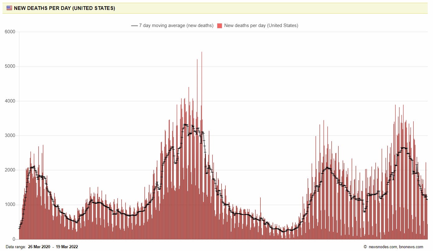
Hospitalizations and deaths
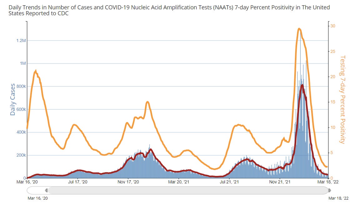
Because cases continue to decline, national hospitalizations are declining fast and the trend is looking really good. In fact, we’re close to reaching our lowest recorded COVID hospitalizations since the pandemic began.
Deaths also continue to decline slowly but surely. Unfortunately, today, we’re still loosing 1,100 Americans per day to COVID19.
Bottom line
BA.2 is finishing BA.1’s job, making overall global patterns inconsistent. In the U.S., case declines are losing momentum and starting to plateau. There may even be signs of increasing trends in the Northeast. But, for now, many pockets still have low transmission. Enjoy it! And prepare for the possibility of putting your mask on if needed. This is also the perfect time to get boosted, get vaccinated, and order your second set of free antigen tests. We will then be ready for whatever the future holds.
Love, YLE
“Your Local Epidemiologist (YLE)” is written by Dr. Katelyn Jetelina, MPH PhD—an epidemiologist, biostatistician, professor, researcher, wife, and mom of two little girls. During the day she has a research lab and teaches graduate-level courses, but at night she writes this newsletter. Her main goal is to “translate” the ever-evolving public health science so that people will be well equipped to make evidence-based decisions. This newsletter is free thanks to the generous support of fellow YLE community members. To support the effort, please subscribe here:
This is far and away the best summary of current status I have read anywhere. Nuanced and clearly communicated as always, avoiding the fear mongering in many recent articles in national press while clearly describing the range of pathways. And thank you thank you for highlighting base effects for these enormous percentage changes! Best COVID-19 newsletter out there.
As always, thank you for the excellent update. Is there a link to access the old and new CDC transmission maps that Dr. Salemi found that are interactive with click-through county specific transmission rates? Thanks.
Clearly, your reporting underscores the tragedy that last week, congress scrubbed the Covid-19 preparedness funding from the $1.5 trillion spending bill. Haven't we learned? What were they thinking?