
Thanksgiving Surge?
It’s been 2 weeks since Thanksgiving and I was curious if we had a “surge upon a surge”.
In other words, did our acceleration (the rate of cases) change after Thanksgiving? Unfortunately, it’s a very simple question with a very complicated answer. If this blog were my day job, I could statistically figure this out. But it’s not, so I triangulated a few other data sources instead. This is what I found…
TEST POSITIVE RATE (TPR)
TPR is now 20.3% in the United States. It increased 15% since Thanksgiving. TPR is particularly concerning in the Southeast, where it’s increasing at higher rates since Thanksgiving than the rest of the country. While the Midwest finally seems to be moving past their peaks, their TPR’s are increasing again (likely related to Thanksgiving), which will slow their decline. The WHO has stated that countries need a TPR below 5%. While testing does not have a direct benefit because there is no cure, there are a number of indirect benefits: 1) public health officials know the “true” rate of infection and can deploy resources to the right areas to stop spread; 2) psychologically if someone tests positive then they are more likely to quarantine (hopefully).
CASES
Cases have increased 21% since Thanksgiving. Cases increased 22% two weeks before Thanksgiving. New hot spots have popped up since Thanksgiving, particularly along the Sun Belt (southern CA, AZ, TX) and the Northeast. Boston, in particular, has surpassed 100 daily cases per 100,000. And while Vermont and Maine have been more than impressive this entire pandemic, they too are seeing doubling rates.

HOSPITALIZATIONS/DEATHS
Not enough time has passed since Thanksgiving to see the impact on hospitalizations/deaths. But there is no reason to believe they will not continue to mirror case trends. Fatality rate (number dead out of the number with positive COVID19 tests) continues to remain steady in the United States at ~1.9%. We should continue to see this, unless out health systems are strained too much. Then hospitals will have to start making hard decisions on who to save and who not to save. In April, Italy had to make these decisions (they decided not to treat those 80+ years) and fatality rate increased.
MOBILITY
Airports. The CHOP Policy Lab found circumstantial evidence that the most concerning areas of the country post-Thanksgiving are adjacent to our busiest airports: Los Angeles, Boston, DC, Atlanta, and Dallas. In other words, Thanksgiving air travel led to increased local transmission. For example, in Clayton County, Georgia (home to the Delta Hub and Atlanta airport), cases are doubling compared to surrounding counties.
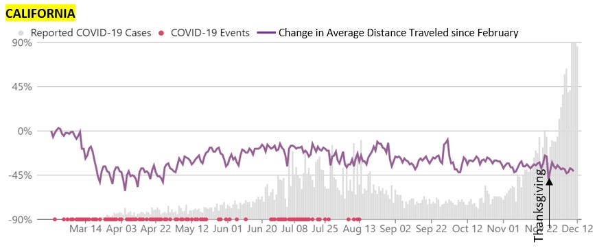
Distance Traveled. Interestingly, distance traveled did not change, on average, by much. We see an increase right before Thanksgiving, but honestly not as high as I would have expected. This only means people, on average, didn’t travel far. This doesn’t mean that family wasn’t close by and people didn’t get together. It was also very obvious that distance traveled varied by states too (see Figures). Wish I had more time to look into this. But still adds a little piece to the puzzle.


Conclusion: Right before Thanksgiving we were starting to see a plateau in cases. Then, after data reporting caught up, our cases continued exponentially increasing after Thanksgiving. So, I don’t think we saw a surge upon a surge. But we definitely didn’t stop our original surge. The pandemic continues to ravage our communities across the United States.
Love, YLE
Data Sources: I triangulated many sources of data for this report. I couldn’t have done it without the beautifully clean and workable data and graphs from the following sites:
COVID19 Tracking Project: https://covidtracking.com/data
CHOP Policy Lab: https://policylab.chop.edu/covid-lab-mapping-covid-19-your-community
UnaCast: https://www.unacast.com/covid19/social-distancing-scoreboard